Bar website design: a cocktail bar concept called Bar 36
What a bar website looks like when the site is the room.
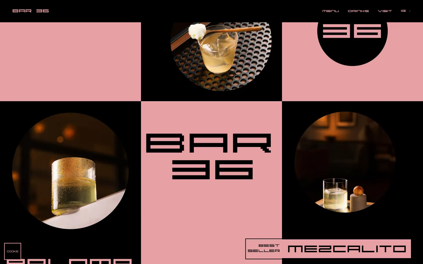
An example of a website and Instagram design for anyone opening or running a bar, adaptable to their concept, shown on our own concept, Bar 36 in London: a responsive site with scroll, motion and WebGL, plus an 18-post grid in pink and black.
The idea
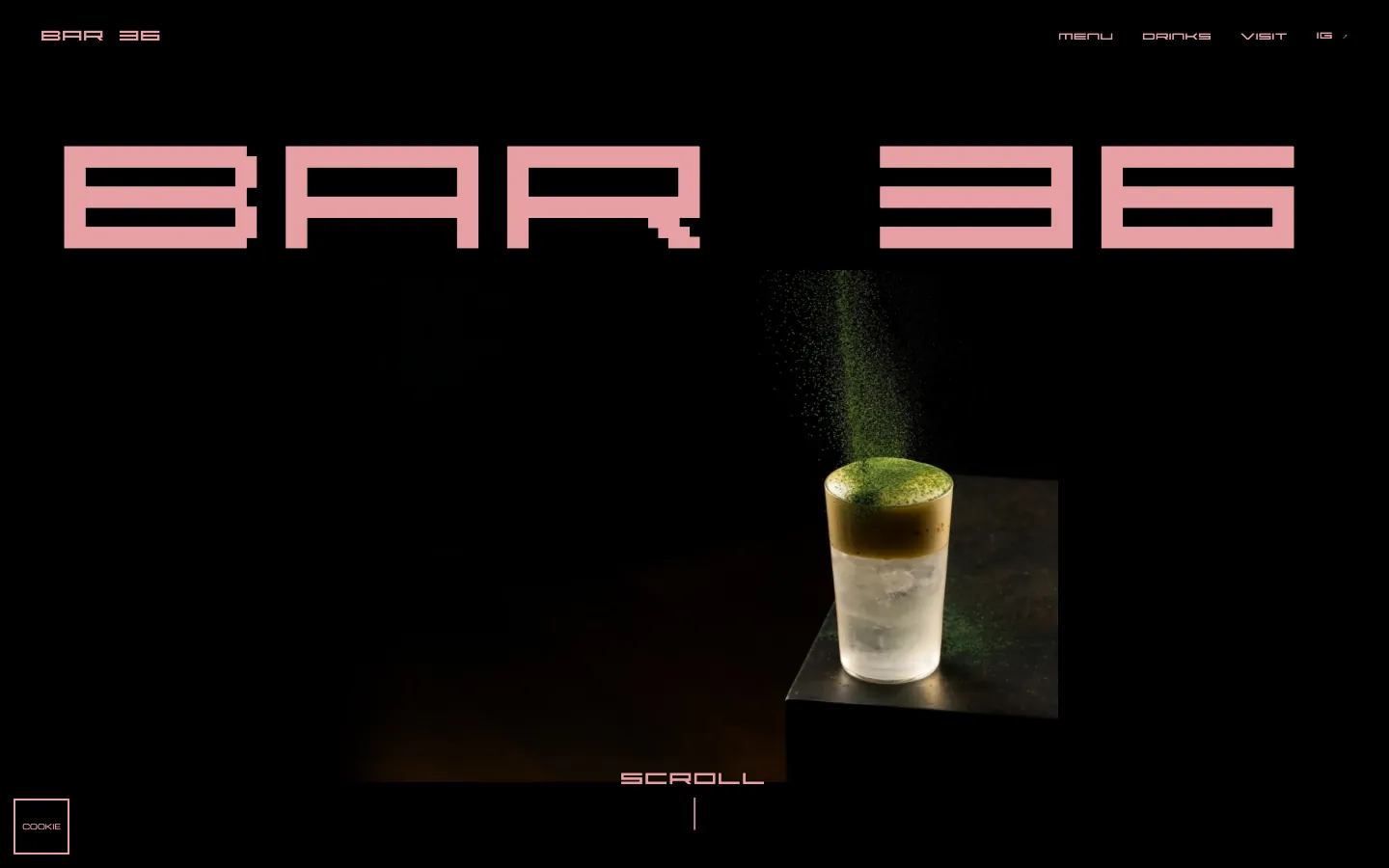
Three choices carry Bar 36: two colors, one shape, and a scroll that does the introducing. Pink and black only. Every photograph cropped to a circle. And a hero photograph that grows, shrinks and lands in the grid as you scroll. Bar 36 is a made-up cocktail bar in Canary Wharf, London. It has no address to visit; it exists so we could see what those choices do to a visitor.
The design brief
Modern and minimal, with cocktails and the craft behind them as the subject. One loud display typeface, ABSTRACT, for names and headlines, and one calm, wide one, Michroma, for anything people have to read. The Instagram grid is eighteen posts; the website reproduces them as its first eighteen tiles and adds more drinks after them.
Two colors, one shape
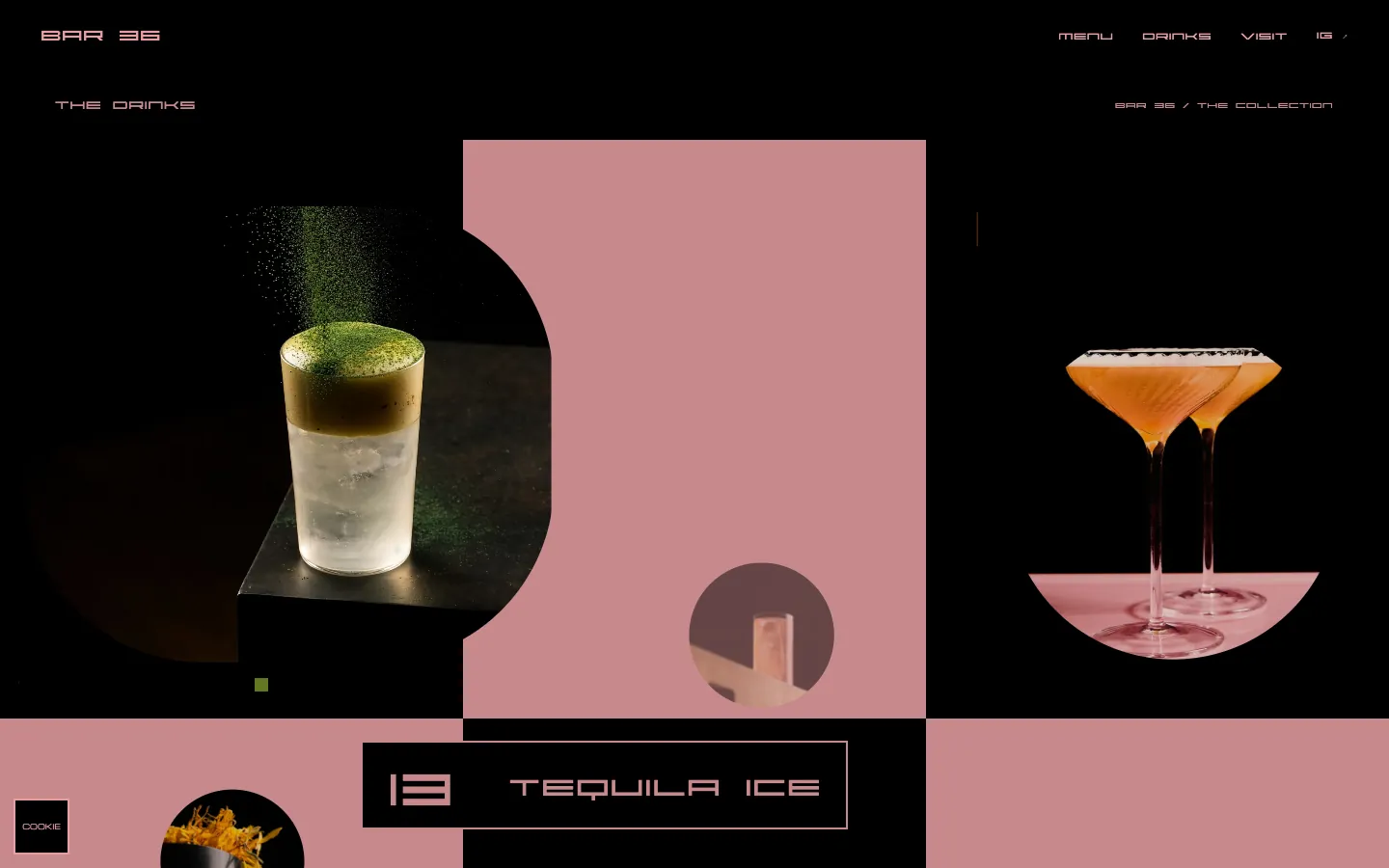
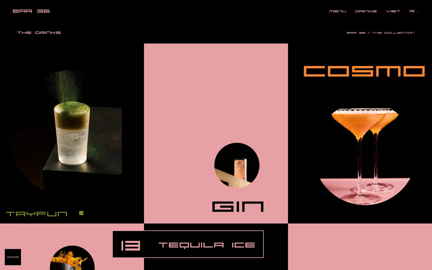
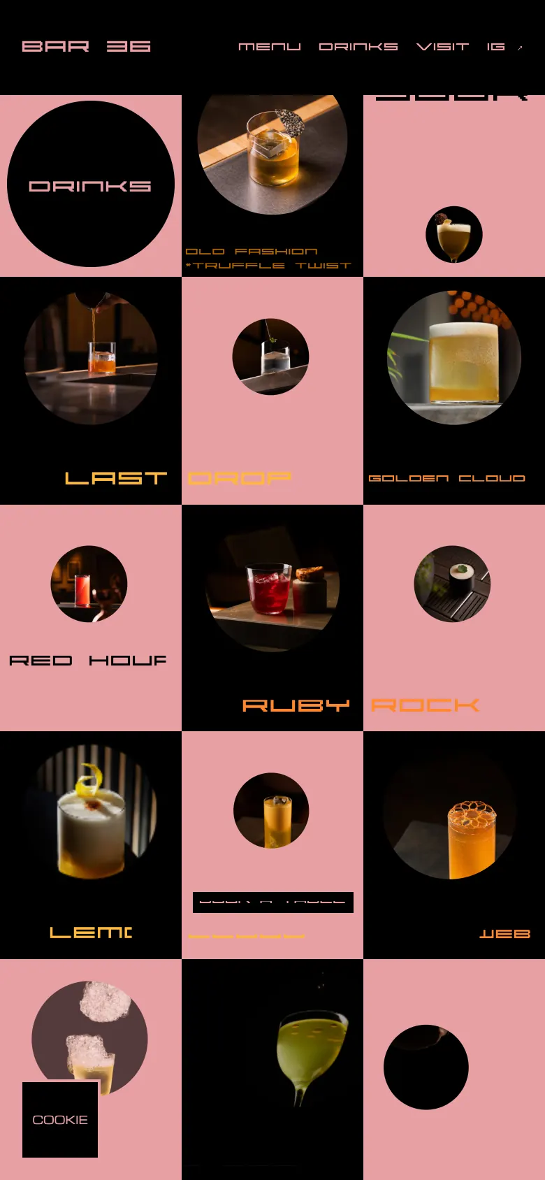
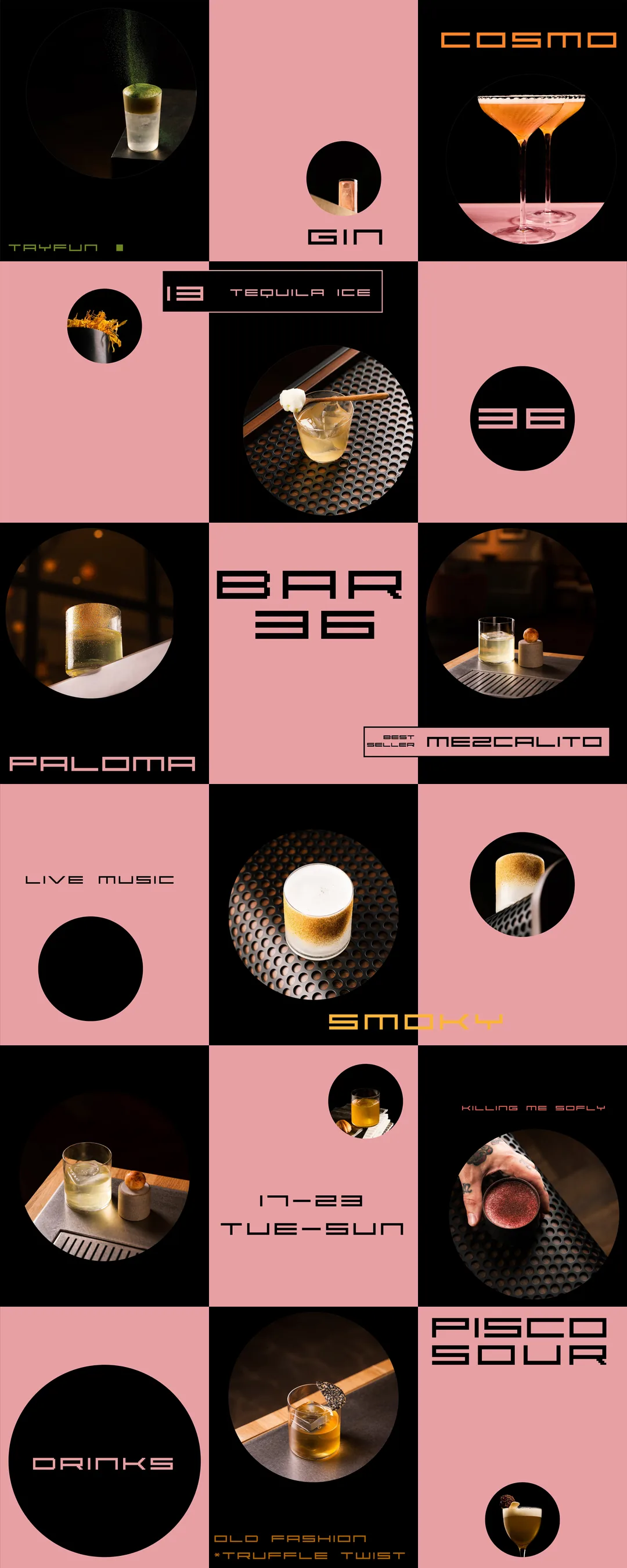
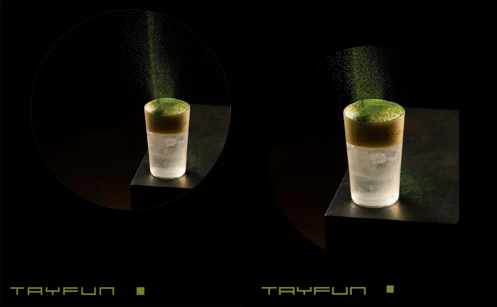
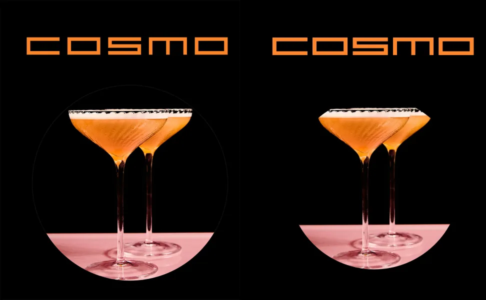
Pink and black only, so the garnish and the glass are the loudest things on screen. The circle is the one shape the grid, the hover cards and the hero landing all share, which lets very different photographs sit together on one page.
The scroll sequence
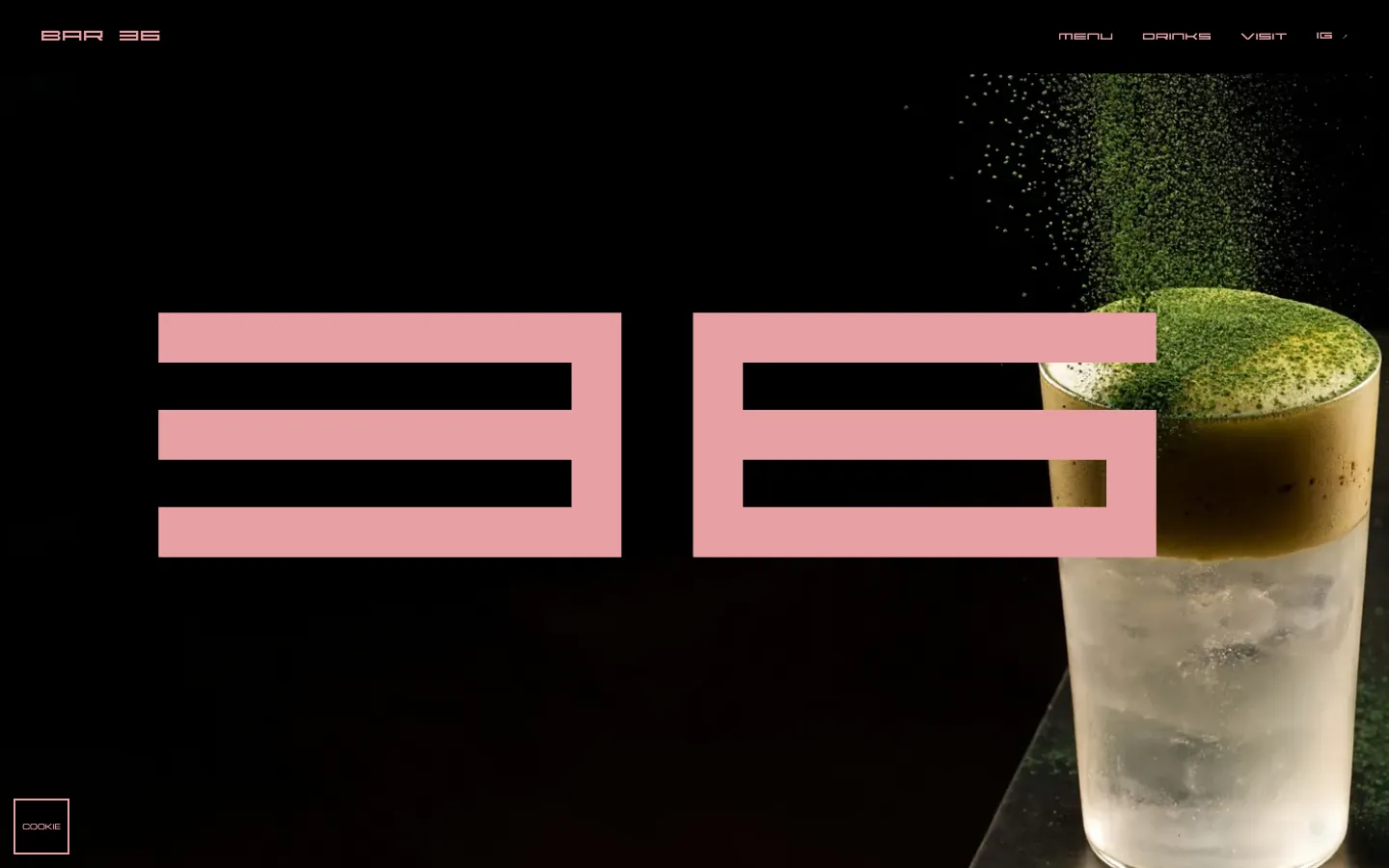
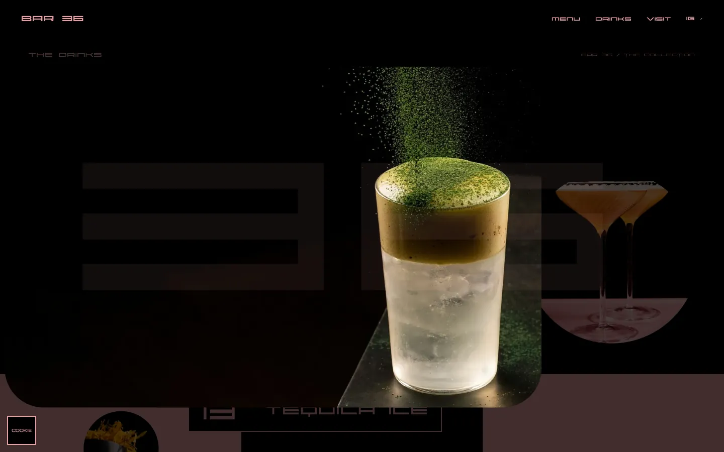
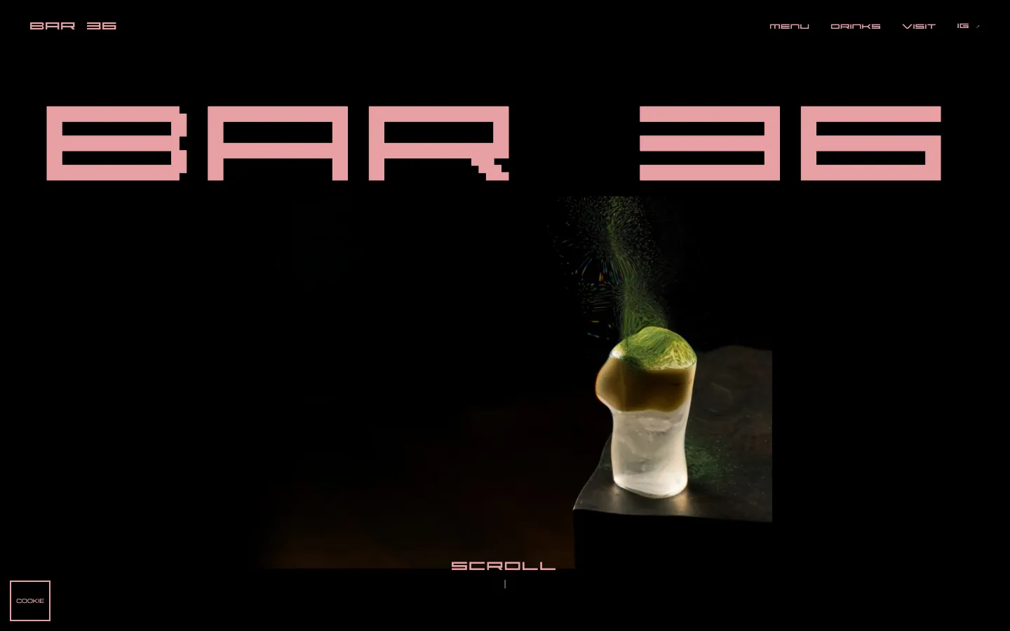
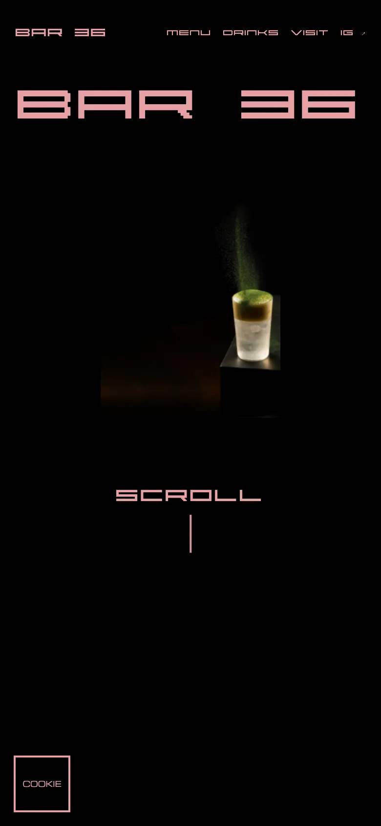
A photograph sits in a rectangle under the name. Scroll and it grows to fill the screen, shrinks, rounds off and lands as a circle in the first tile of the grid, which then continues below it. Scroll up and it plays backward. After that, every tile enters its own way (a wipe, a slide, a flip, a zoom) driven by how far you have scrolled.
The photograph reacts to you: WebGL
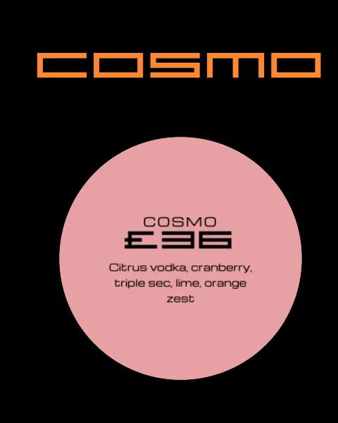
Run a cursor over the hero photo and it ripples like the top of a drink, with a faint color split along each wave. That is WebGL, a shader written for this page. Hover a drink further down and a circle opens with its name, price and ingredients, in the opposite colors of the tile, and the text rides the same ripple. The headline that settles into place at load uses an SVG filter instead, not WebGL. Ask your device for reduced motion and the scroll animation and the WebGL effects do not run.
Made for phones and desktops
On desktop the grid runs three columns edge to edge and the menu card opens on hover. On a phone the same three columns fit the narrower screen, and the menu and drink cards open on tap. We checked 390 and 430 pixel widths and found no sideways scroll.
The menu and the reservation card (demo)
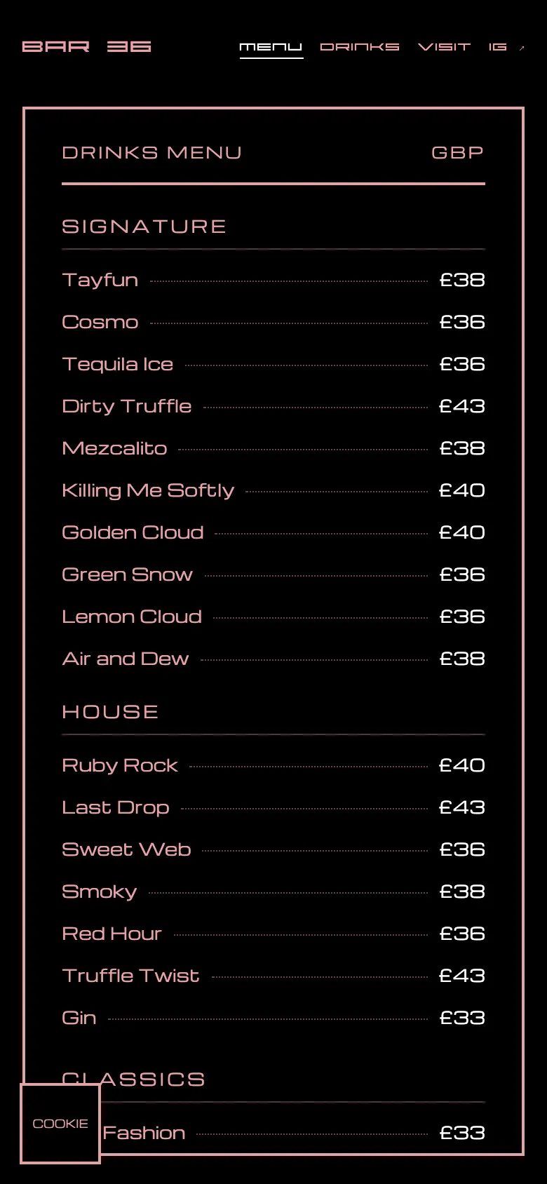
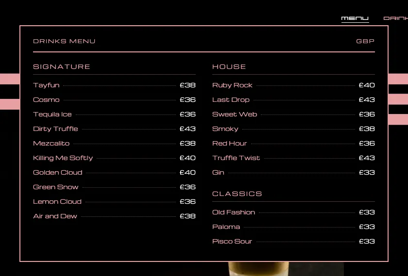
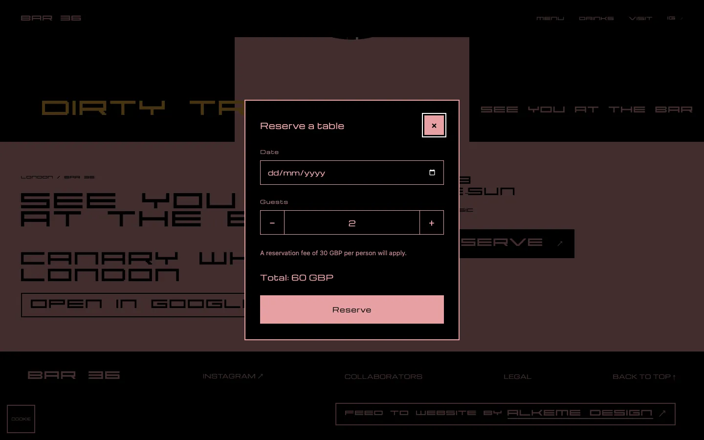
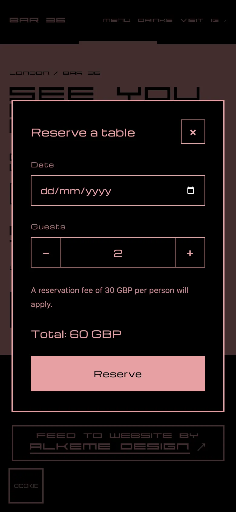
MENU opens a card with twenty drinks in three groups. Reserve opens a card with a date, one to twelve guests, a closed-on-Mondays rule and a running total at 30 pounds a guest. It is a demonstration interface with no connected backend or payments: press Reserve and the card tells you nothing was sent or charged. A live booking system would be a separate build, scoped with a real venue. The drinks, prices and ingredients are demo content.
The Instagram grid, and its twin on the site
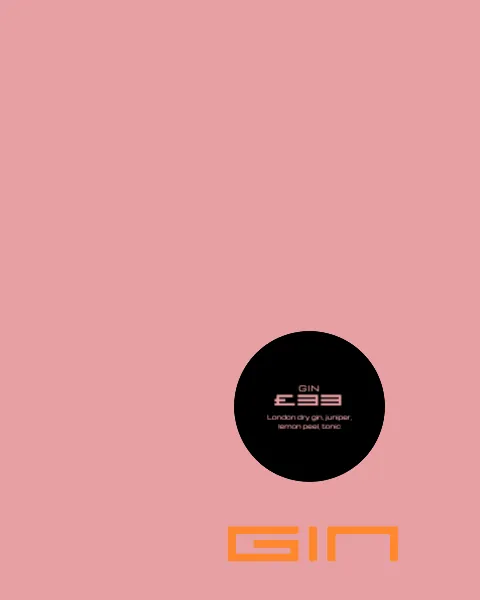
Eighteen posts, 1080 by 1350, laid out as one pink-and-black wall. The website's first eighteen tiles reproduce those posts, so a post and its tile are one picture on two screens. The design work here is the posts and the grid; this project does not cover running the account.
What we did
- Concept
- Responsive website design and build, desktop and mobile
- Scroll, motion and WebGL interaction
- Menu and reservation interface (demonstration)
- 18-post Instagram grid design
Who this is for
This is for people who own a bar or are about to open one, and for operators launching a concept or rebuilding a website and Instagram presence. The need is specific: an atmosphere people recognize online, a phone experience that shows the menu and gets to a reservation, and a site and a feed that read as one place. Bar 36 has no client of its own; it is our portfolio concept. Here is where the same approach fits.
Listening bars and vinyl bars
Listening bars and vinyl bars sell a sound and a mood. A site and a feed can set that up before the first record: a tight palette, sleeves and speakers photographed like products, motion that keeps the tempo of the room. For a listening bar we would start from the room, the system and the music.
Coffee shops and coffee bars
A coffee shop needs people to recognize the place before they walk in: the menu, the hours, how the counter looks, and a site and a feed that read as one place. Warm crops, a quiet palette and a menu that opens where you are would carry that.
Cocktail bars and lounges
That is Bar 36: drinks, light and type setting one mood from the first photograph to the last tile.
Members' clubs
A members' club shows the room without handing it over. The site decides what to reveal, what waits for the door, and how a request to join arrives.
Clubs and nightclubs
A club lives on its nights: the lineup, the lights, a phone at midnight. Motion and WebGL suit that if the page loads fast and reads clearly on a small screen.
Questions we get
What should a bar website show first?
On Bar 36 the first thing is a photograph of one drink under the bar's name. The menu card and the reserve card are a hover or a tap away.
Is Bar 36 a real bar?
No. It is a portfolio concept set in Canary Wharf, London: a responsive website and 18 Instagram post designs.
What would a website and Instagram design for my bar include?
The parts you see here: a responsive website with scroll and motion, a drinks menu card, a reservation interface and a grid of Instagram post designs. They are two separate services, web design and Instagram grid design, and Bar 36 shows what changes when both come from one idea. Bring your concept, your city and any photographs, menu or brand material you already have; the scope is agreed around your venue and what its visitors need to do.
Can you build this for my bar, coffee shop, listening bar or club?
We can discuss it. Websites and Instagram grids for bars, restaurants and other venues are part of our hospitality work. Bar 36 is a cocktail bar concept; for a listening or vinyl bar we would start from the room, the sound system and the records, for a coffee shop from the menu, the hours and the counter, and set out the work in a proposal. Tell us the concept, the city and how far along you are with the opening.
What did Alkeme Design make for Bar 36?
A responsive website with its scroll sequence, motion and WebGL effects, a drinks menu card and a reservation interface, plus the designs of an 18-post Instagram grid, all in one pink-and-black language.
Does the website work on mobile?
Yes. It was built for desktop and mobile together. On a phone the three-column grid fits the narrower screen, the menu and drink cards open on tap and the reservation card fits the screen. We checked common phone widths, 390 and 430 px, with no sideways scrolling.
Is that WebGL, or just animation?
Two parts are WebGL: the ripple on the hero photograph and the same ripple on the text of the drink hover cards. The headline settling at load is an SVG filter, and the scroll effects are GSAP animation. With reduced motion requested, the scroll animation and the WebGL effects do not run and every image stays visible.
Can people book a table through the site, and are the drinks real?
No to both. The reservation card is a demonstration: a date, the guests, a total at 30 pounds per guest and a closed-on-Mondays rule. It sends nothing and takes no payment, and says so on screen. The drink names, prices and ingredients are demonstration content. If your venue needs real bookings, how the site connects to your booking system is something to discuss in your proposal.
Do you manage Instagram accounts?
On Bar 36 the work is the post designs and the grid, not account management. Scope is agreed per project.
Decisions, and why
Pink and black only
Fewer colors make the garnish and the glass the loudest things on screen.
Circles everywhere
It is the shape the grid, the hover cards and the hero landing all share, so the page feels like one object.
A readable second font
ABSTRACT is great at three words and tiring at thirty. Michroma carries the menu, the cards and the footer.
Scroll sets the pace
The hero sequence and the tile entrances follow how far you scroll, in both directions, rather than a timer.
What exists today
A working responsive website with scroll, motion and WebGL, and an 18-post Instagram design, built as a portfolio concept.
Planning a bar, coffee shop or club?
Send us the concept, the city and how far along you are with the opening. We'll tell you what fits and what it takes.
Start the conversation →More work


Want work like this?
Tell us about your brand and what you need. We reply personally.
Start a project →